
Project overview
Secura is a scalable web platform that simplifies real-time threat data, system risks, and network metrics. It helps security teams prioritize issues and respond quickly through a clear, actionable interface built with strong UX/UI principles.
ROLE
Senior Product Designer
TIMELINE
2025
Tools
Figma
Design Challenges
Key challenges included making vast amounts of raw cybersecurity data understandable at a glance, establishing a clear information hierarchy, and balancing advanced technical workflows with usability. I also needed to ensure visual and functional consistency for future scalability. Solving these challenges required prioritizing critical information, simplifying interactions, and applying progressive disclosure to avoid overwhelming the user with complexity.
Design Process & Approach
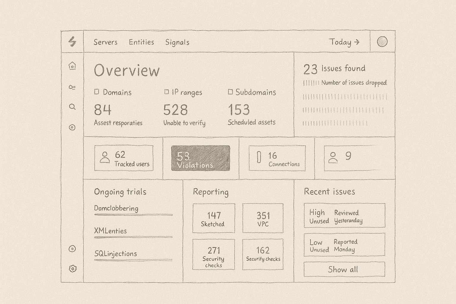
I structured the dashboard using low-fidelity wireframes focused on clear navigation and information prioritization. Without user research, I applied domain best practices to simulate real-world workflows. The process emphasized top-level summaries, minimal distractions, and intuitive user flows for rapid situational awareness. - Ideation and Wireframing Early wireframes defined a grid-based layout where users could instantly see active threats and overall system status. I mapped user flows based on what security teams need first: awareness, drill-down, and action. This structure enabled users to quickly scan and explore deeper as needed. - Visual Design and Hierarchy A dark UI theme with bold accent colors improved readability and alert visibility. I used strong typography, consistent spacing, and color-coded indicators to drive focus. Every element served a functional purpose, creating a clean but powerful aesthetic ideal for data-heavy cybersecurity environments. - Component-Based Design and Tokens To ensure scalability, I created a flexible component library in Figma, supported by design tokens for colors, typography, and spacing. This modular approach made future dashboard updates and expansions seamless, keeping the interface cohesive and development-friendly. - Iteration and Refinement Multiple Figma iteration cycles focused on refining visual clarity, interaction flows, and pixel-perfect alignment. Interactive prototypes simulated real user behavior, helping fine-tune navigation and identify usability improvements. Consistent self-review kept the design evolving toward simplicity and impact.

Final Outcome & Solution
The final dashboard delivers a clean, scalable platform where critical cybersecurity metrics, active threats, and infrastructure health are surfaced immediately. The modular card-based layout prioritizes situational awareness, with high-contrast visuals making urgent information stand out. Navigation is simple and intuitive, supporting both quick scanning and deeper investigation into details. Thanks to the design system approach, new sections or data types can be added without breaking consistency. Overall, the dashboard bridges the gap between technical depth and user-friendliness, empowering security teams to respond quickly and confidently.

Impact & Takeaways
This project demonstrates how strategic UX thinking can simplify highly complex data environments. Working end-to-end, from ideation to final UI, I created a dashboard that balances technical precision with usability and scalability. It reinforced the importance of strong hierarchy, consistent component design, and a user-centered mindset when building enterprise-grade tools. This case study is a clear example of my ability to lead solo design efforts while applying product design best practices, making it a strong highlight within my broader UX/UI portfolio.